
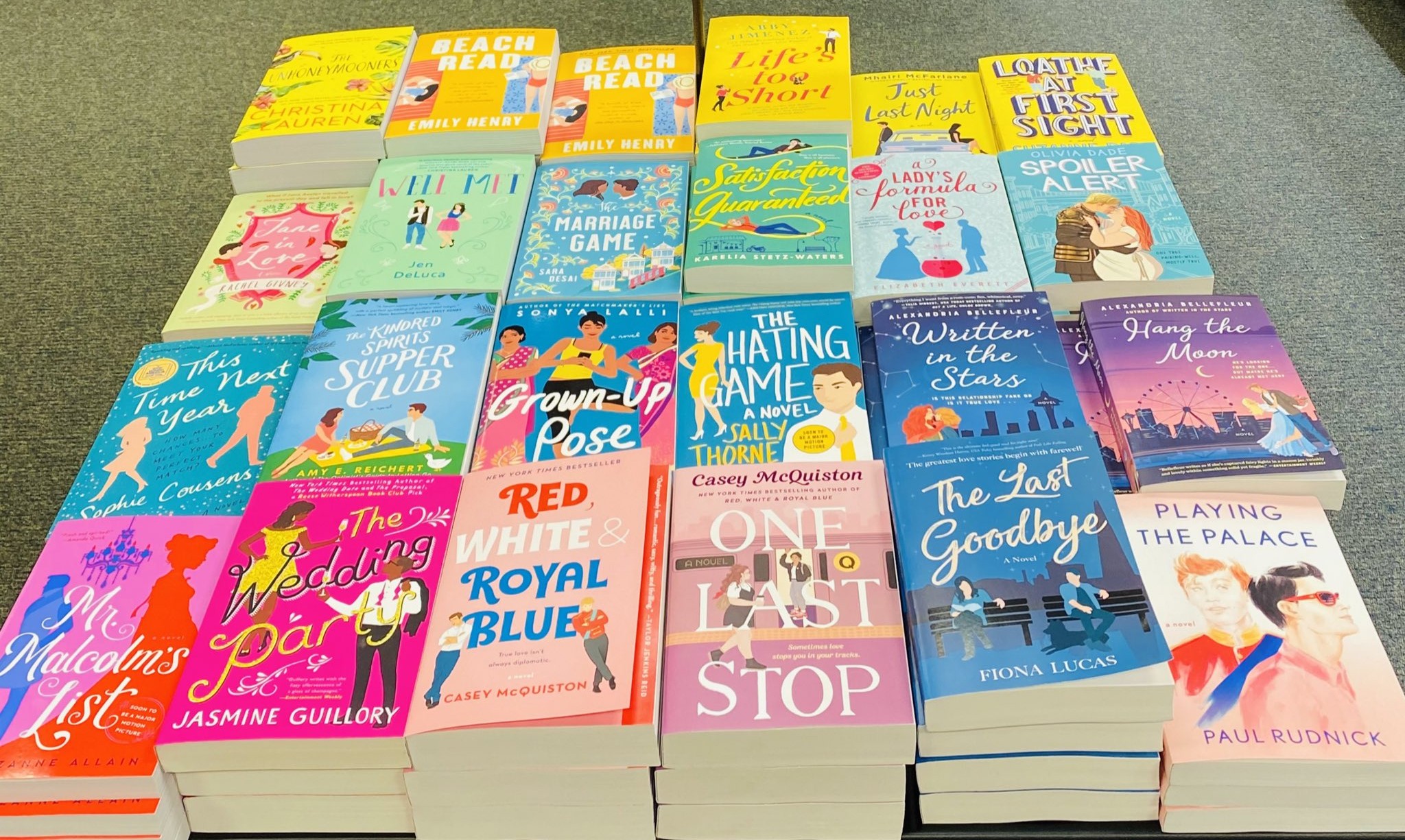

If you walk into any Barnes and Noble, you’ll be bombarded by the oversaturated pinks, purples and turquoises of modern romance novels with two indistinct, yet quirky illustrated blob people on the cover.
Why do romance novels look like this?
Book Covers Copy What’s Popular
There was this little series first published in 2005 that blew up from 2008-2012. Maybe you’ve heard of it. It’s called Twilight. The covers of this series are now iconic and at the time the books blew up, everyone wanted to elicit the feeling of it to get people to buy their books too.


Twilight was massive and everyone wanted a slice of the money pie. The Vampire Diaries series, which was originally published in 1991, was redesigned to fit the trend. Pride and Prejudice was given a fresh coat of paint. Wuthering Heights had a redesign that included a book sticker that read “Bella and Edwards favorite book”. And, very fittingly, the Twilight-fanfiction-turned-novel Fifty Shades of Grey, published in 2011, jumped in on the trend as well.
What Started The Current Trend?
It seems the trend began with The Hating Game which was a 2016 debut novel by Sally Thorne that absolutely blew up that very same year. This was the cover:

Look familiar? While this book didn’t have the cultural dominance of Twilight, still just a little over 3 years later in 2019 and a majority of romance novels had appropriated this look.


It’s been 9 years now since 2016 and 6 since 2019 when this style really took off, and yet we’re still stuck with this cover style for romance novels. Why? Well despite the saying, no, capitalism does not, in fact, breed innovation. The style has been set by its successful predecessor and nothing will change until a new innovator (highly successful novel that doesn’t follow the current cover trend) comes in to set the new standard that we will inevitably all tire of. We’re in a sort of feedback loop with the covers as well with the massive success of authors like Abby Jimenez and Emily Henry who both use the same style for their covers.


With how incredibly successful these two authors are, they absolutely have the ability to do something more interesting with their covers, but alas, it’s blob people for now.
An Attempt To Mask The ‘Shame’ Of Reading Smut
Beyond that, there’s a certain taboo that comes from reading and buying books containing explicit sex scenes. The frivolity of women reading romance has been discussed and debated time immemorial. So what better way to disguise the fact that you’re reading a book about the main character getting railed then making it look like-
They Look Just Like YA Covers


One of these books is a YA romance and the other is explicitly and unapologetically smut and uses language that is absolutely adult. Can you tell which is which? Of course you can’t, unless you’re already familiar with Icebreaker. In an attempt to disguise itself, adult romance has slowly made itself indistinguishable from YA by glancing at the cover and synopsis alone.
The confusion goes both ways. There are reviews on Rival Darling complaining about the lack of ‘spice’ and there are reviews on Icebreaker mentioning how they bought this for their preteen child because it looks like a book that would usually be ok for her. This phenomenon isn’t new either. Remember Twilight? It’s YA. Fifty Shades of Grey on the other hand is contains adult themes and content. But they both follow that macrophotography trend that was set by Twilight, muddying the water.
But why is there nothing that distinguishes these two from each other? There’s nothing in the plot synopsis and there’s nothing on the back of the book that indicates one is for adults and the other isn’t. Looking at the back of a handful of the romance novels I own, the back of the book lists one as ‘contemporary romance’, a few are simply ‘novel’, only one lists ‘for ages 14 and up’, and majority of the others have no classification.
How do we fix this? Well, comics and manga already have identifiers and have for a very long time. Manga and comics both have a mature or 18+ indicator on the back of the book, will often list what themes classify the book as such, and will occasionally be wrapped in plastic to prevent any unwanted peepers casually perusing through. For a novel I think the plastic wrap would be overkill, but the other indicators are discrete and would prevent the confusion we’re seeing.
So Why Do Romance Novels Look Like That?
It’s a combination of following trends, the unoriginality capitalism breeds, and an attempt by women to obfuscate reading a genre that’s constantly demonized but is actually just as valid as the rest of them. Eventually the current trend will die and some other design will make itself ubiquitous.

Leave a Reply